

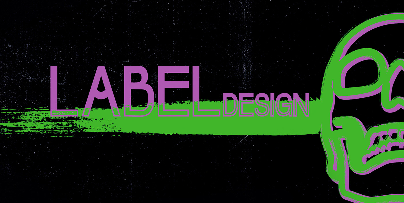
Этикетка для серии крафтовых Самбуки и Абсента
В данном проекте я разработала фирменный стиль и этикетку для крепких алкогольных напитков. Заказчик хотел видеть сдержанный, но яркий дизайн. Основной акцент необходимо было сделать на то, что это крепкий - "ударный алкоголь" для вечеринок.
//
Label for a series of craft Sambuca and Absinthe
In this project, I have developed a corporate identity and label for strong alcoholic beverages. The customer wanted to see a restrained but bright design. The main emphasis had to be made on the fact that it is strong - "shock alcohol" for parties.
Я выбрала неон-направление дизайна и изображения черепа, чтобы подчеркнуть яркость ощущений и некий вызов для потребителя этих напитков.
//
I chose the neon direction of the design and the image of the skull to emphasize the brightness of the sensations and a certain challenge for the consumer of these drinks.


__________________________

Я так же занималась разработкой лого компании, мою работу можно посмотреть здесь: Логотип "Мое ремесло"
Спасибо за просмотр!
//
I also worked on the development of the company's logo, my work can be viewed here: craft distillery logo
Thanks for watching!


